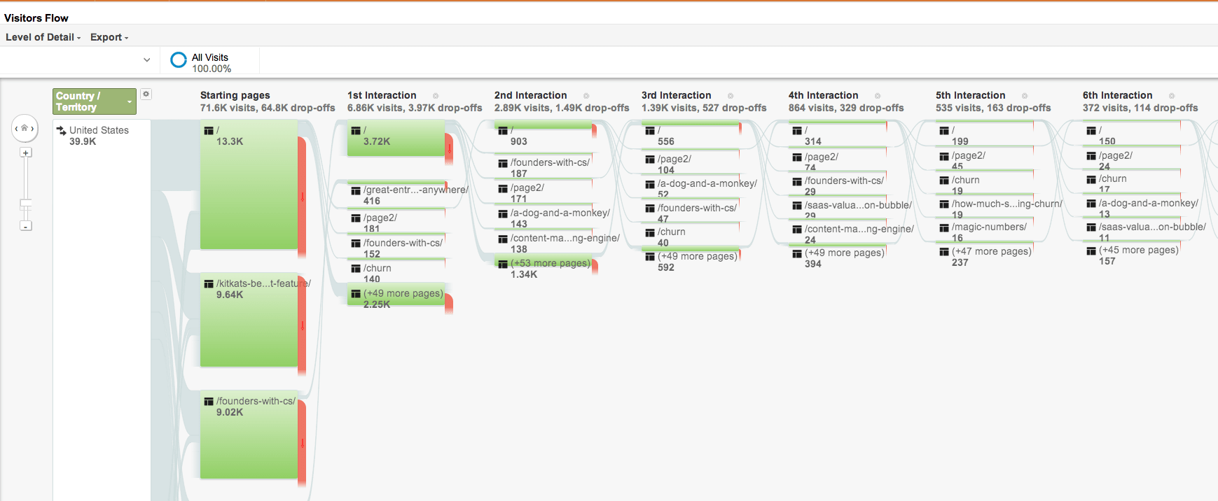
I first learned about Sankey diagrams in my thermodynamics class and they’ve since become one of my favorite data visualizations and analysis tools. Sankey diagrams, like the one above of visitors to this blog, show the flow of things. Originally created for measuring the flow of energy through powerplants, they are incredibly useful for content marketing analysis, visitor analysis or any other kind of funnel analysis.
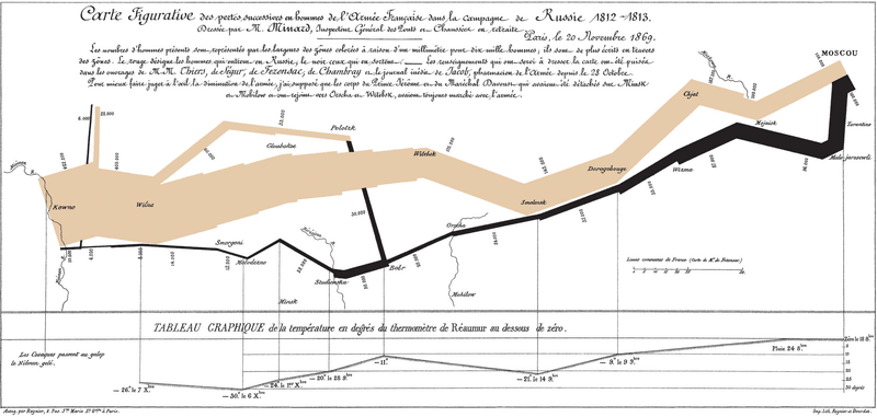
The best Sankey diagram ever created is Charles Joseph Minard’s depiction of the Napoleonic War, which was made famous in Edward Tufte’s Book, The Visual Display of Quantitative Information. It’s amazing because there are at least five different dimensions of data displayed in an intelligible way. Try that with any other chart.
I use Sankey diagrams to understand how people navigate through this blog. At the bottom of this page, I’ve created a Read This Next box. Google Analytics’ Sankey diagram showing user behavior is the most intuitive way I’ve found of understanding and measuring the impact of that feature.
To see your GA Sankey diagram, click the Behavior tab, then the Behavior Flow tab from the Google Analytics home screen. You’ll see a chart like the one above.
When I log in, I look first at the 1st interaction to see the breakdown of how people arrive at my blog. Next, I want to understand how they navigate the site. By looking at the patterns for each subsquent interaction, I can get a sense and by tallying the page views in each of the first eight interactions, I know that the Read This Next Feature increases page views by 10% in total.
More importantly, for engaged users (those who click on at least one more page), Read This Next doubles page views. Last, the Read This Next Feature drives 10.5x the number of page views as the previous/next buttons on the index page and 128% more traffic than the home page link at the top of the page.
Sankey diagrams can be applied in sales conversion funnels to understand how efficient teams are in closing customers and where in the process the most effective improvements can be made. They can be used to understand customer lifetimes, upgrade cycles. Properly applied, Sankey diagrams provide deep insight into longitidinual patterns. Give them a try the next time you’re tempted to employ a funnel.
The two best ways I’ve found of creating Sankey diagrams are D3’s Sankey toolkit by Michael Bostock (which can also be done in Excel) and RCharts in R; but there are many ways.