When I first started writing, I wondered how I could make charts like those in the Economist or in the New York Times, the beautifully formatted ones. After some research, I figured out how. And this post explains how you can do it, too.
Many data scientists use a free open-source language called R. It’s a great tool for processing data and I use R to process all the data for this blog. You can download it here. Alternatively, many people use RStudio, an editor which makes R much easier to use. To make these charts, I use a library written by Hadley Wickham called ggplot2. ggplot2 has all kinds of charts: area, line, bar, etc. You can see all of them here
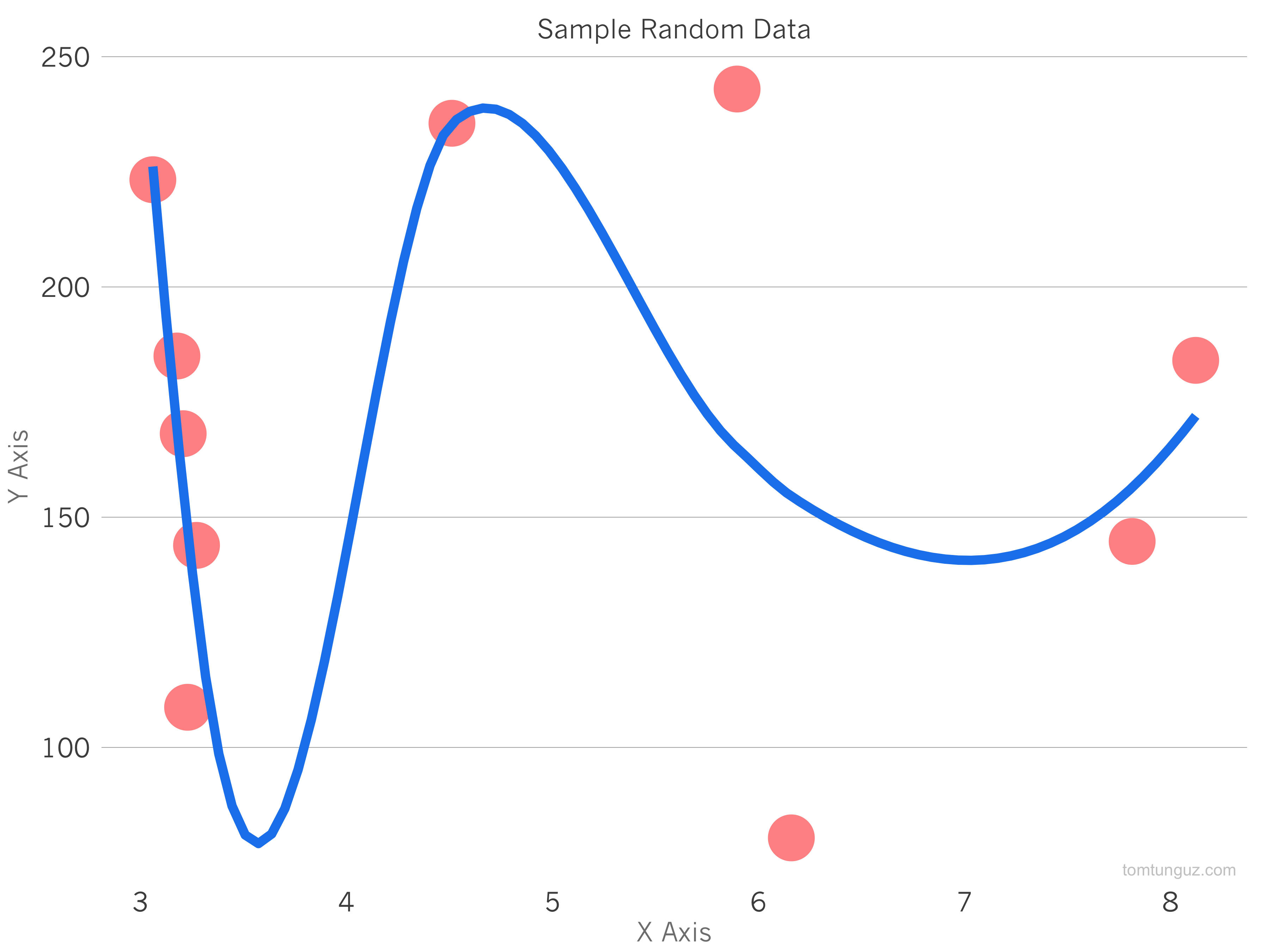
That all sounds much more complicated than it is. To make the chart above which is a point chart of random data, just download RStudio, create a new file and paste the code below into it. Then hit the run button and you should have it. My code borrows heavily from Max Woolf’s tutorial for the theme function. I used to do it all in line, but collecting all the formatting details in a function is an elegant way of formatting the plot. Max’s post is well worth reading to understand some of the more complex features of ggplot.
#install and load charting library
install.packages("ggplot2")
library(ggplot2)

#create a data set with random data
data = data.frame("x" = runif(10, 3,10), "y"=runif(10,50,250))

#define the way the chart looks
new_theme <- function() {

# Set the core colors
color.background = "white"
color.grid.major = "gray70"
color.axis.text = "gray30"
color.axis.title = "gray50"
color.title = "gray30"

# Other key values
theme_bw(base_size=18) +
theme(text=element_text(family="Helvetica")) +

# Set the backrgound
theme(panel.background=element_rect(fill=color.background, color=color.background)) +
theme(plot.background=element_rect(fill=color.background, color=color.background)) +
theme(panel.border=element_rect(color=color.background)) +

# Format the grid
theme(panel.grid.major.y=element_line(color=color.grid.major,size=.25)) +
  theme(panel.grid.major.x=element_blank()) +
theme(panel.grid.minor=element_blank()) +
theme(axis.ticks=element_blank()) +
theme(strip.background = element_rect(fill="white"))+

# Format the legend, bottom by default
theme(legend.position="bottom") +
theme(legend.background = element_rect(fill=color.background)) +
theme(legend.key = element_rect(colour = 'white')) +
theme(legend.text = element_text(size=18,color=color.axis.title)) +

# Set title and axis labels, and format these and tick marks
theme(plot.title=element_text(color=color.title, size=18, vjust=1.25)) +
theme(axis.text.x=element_text(size=18,color=color.axis.text)) +
theme(axis.text.y=element_text(size=18,color=color.axis.text)) +
theme(axis.title.x=element_text(size=18,color=color.axis.title, vjust=0)) +
theme(axis.title.y=element_text(size=18,color=color.axis.title, vjust=1.25))
}

# generate the plot and save it
ggplot(data) + geom_point(aes(x,y), size=10, colour="red", alpha=0.5)+ geom_smooth(aes(x,y), size=3, colour="dodgerblue2") + theme() + labs(title="Sample Random Data", x="X Axis", y="Y Axis") + annotate("text", x = Inf, y = -Inf, label = "My First R Plot",hjust=1.1, vjust=-.5, col="gray", cex=4, alpha = 0.8)
ggsave("random_data.png", width=12, height=9)
After saving the file, I just upload it to Amazon and add a link to a blog post. And that’s it!